")
Deskfully Reviewed: A Minimal Desk Setup Done Right (And What We’d Improve)
Featuring a real workspace by @gong_desk
The Setup
Table Of Content
At first glance, this desk setup gets something right that most don’t:
intentional restraint.
There’s no chaos. No visual noise. Every object feels placed — not just present.
This is a workspace designed with clarity in mind.
What This Desk Gets Right
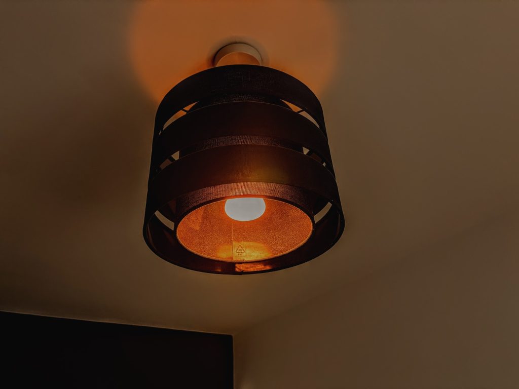
Lighting That Actually Supports Focus
This is where the setup really stands out.
Instead of relying on overhead lighting, it uses:
- A directional task light
- A monitor light bar
- Subtle ambient backlighting
This creates layered lighting, which:
- Reduces eye strain
- Improves contrast on screen
- Builds a calm working environment
Most people underestimate this — but lighting is arguably the biggest performance lever in a desk setup.
See Deskfully’s article on Workspace Lighting
Strong Visual Hierarchy
Everything here points toward the monitor:
- The angled light
- The symmetry of the speakers
- The centred display
Your eye knows exactly where to go.
That’s not accidental — it’s good design thinking.
Clean Surface, Zero Friction
There’s a clear rule being followed:
Only essential tools live on the desk.
Keyboard, mouse, tablet, phone — all accessible, nothing excessive.
This reduces:
- Decision fatigue
- Visual clutter
- Micro-distractions
And that’s exactly what a focused workspace should do.
Check out how to boost focus with reduced clutter from our Article How to Design a Desk Setup That Really Boosts Focus
Cohesive Aesthetic (Without Trying Too Hard)
The setup leans into:
- Dark tones
- Matte finishes
- Soft lighting
Even the wall art reinforces this — subtle, minimal, architectural.
Nothing breaks the visual language.
What We’d Improve (Small Tweaks, Big Gains)
This setup is strong — but a few changes could take it from great to exceptional.
Monitor Height Could Be Refined
The monitor looks slightly low relative to eye level.
Over time, this can:
- Strain the neck
- Encourage poor posture
Fix:
- Raise the display slightly
- Or use a monitor arm for fine adjustment
This is one of the highest ROI changes you can make.
Desk Depth vs Reach
There’s a lot happening close to the front edge:
- Keyboard
- Mouse
- Tablet
- Accessories
This can compress your working space.
Fix:
- Push secondary devices (like the tablet) further back
- Prioritise primary interaction space
More breathing room = better ergonomics.
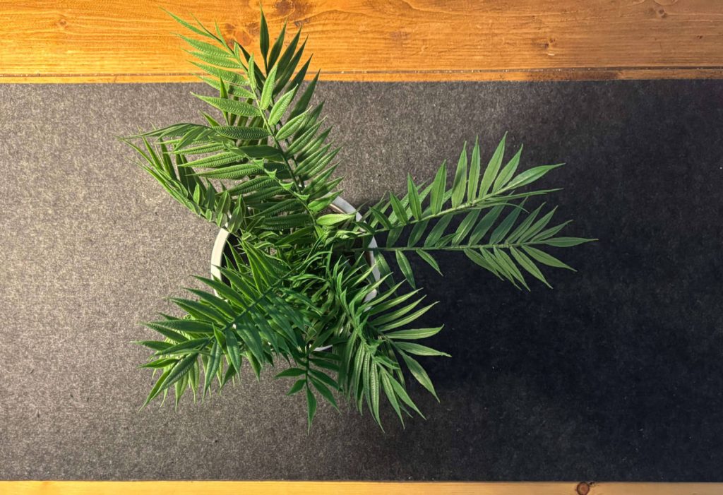
Decorative Balance on the Left
The left side has:
- Shelving
- Objects
- Plant
While the right side is more restrained.
This creates a slight visual weight imbalance.
Fix:
- Either simplify the left
- Or add a subtle counterbalance on the right
The Bigger Lesson
This setup works because it follows a principle most people ignore:
A good desk isn’t about what you add — it’s about what you remove.
Everything here earns its place.
And that’s why it feels calm, focused, and intentional.
Final Thoughts
This is a design-led workspace, not a product showcase.
It proves you don’t need:
- More gear
- More accessories
- More “setup hacks”
You need:
- better restraint
- better layout
- better lighting
")
")

")
